Screw Ups That Hurt The Value Of A Home

I’ve got more than plenty of pictures of things that people do to their homes that really turn off potential buyers, or that just look wrong, or that are totally out of character for the architecture or the theme of a home.
Yes, I’m poking fun, but there’s also a good lesson to be learned from these.
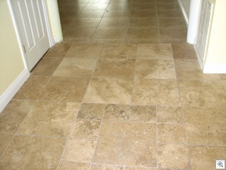
 Our First example is really one of my pet peeves. In general, I hate it when flooring changes from one solid material to another without some sort of transition. It’s certainly ok when the tile or stone stops and the carpet begins, but 2 different solid surfaces abutting each other doesn’t work.
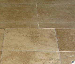
In this case, the travertine is beautiful in general, but it was laid at two different times over the years.
 There’s a great deal of difference between the two different batches of travertine. It’s normal for there to be slight variation when using natural stone when it’s all from the same batch, but in this case, the difference between the two batches is much too obvious.
But the worst thing is that entry way is laid out differently than the room it leads to. Instead of causing the eye to consider it a much bigger area, the eye is forced to stop and it chops the space in two.
I’ve shown this bank owned repo to 2 different people, and both of them thought were turned off before we got 10 feet into the home. The yard full of dead lawn and weeds and the green swimming pool didn’t help either.
I’ll save the granite bathroom counter top for another day during this new series.
